
Encora Inc. Design System
Developing a Unified Design System for Encora Inc.'s Ecosystem

Industry
Information Technology (IT) Services and Consulting
Information Technology (IT) Services and Consulting
Project Type
Design System
UX/UI Design
Design System
UX/UI Design
Tools
Figma
Stark Accessibility
Notion
Figma
Stark Accessibility
Notion
My Role
UX/UI Design Lead
UX/UI Design Lead
Background
With just 4 years in the market under the brand "Encora," this organization has experienced exponential growth, now boasting a global presence in over 17 countries and employing over 9,000 collaborators worldwide.
A rapidly expanding organization like Encora demands scalable design solutions to streamline design and development operations. These solutions are crucial not only for enhancing brand recognition but also for maintaining a consistent and clear brand image across various digital channels.
The Problem
As a rapidly expanding organization offering IT consultancy, nearshoring, and offshoring services worldwide, Encora requires a substantial amount of human talent to meet its service demands. The credibility needed to attract top-tier talent is also bolstered by consistent communication across all digital channels. Previously, Encora lacked its own recruitment platforms, as well as an aesthetically pleasing, accessible, and functional website. The high demand has led to a lack of prioritization for proprietary products, making a design system essential to scale design services to the level required by a multinational corporation like Encora.

The challenge
Creating a design system that is functional, visually appealing, accessible, and scalable.
It must be quickly adopted by design and development teams while also allowing for continuous evolution and improvement over time.

The benefits of implementing this Design System
Consistency: Ensure a cohesive and recognizable brand identity across all digital platforms.
Efficiency: Streamline the design and development process, saving time and resources.
Scalability: Facilitate the scaling of design efforts to meet the growing needs of the organization.
Accessibility: Ensure that digital products are accessible to all users, meeting accessibility standards.
Enhanced Collaboration: Foster collaboration between design and development teams by providing a common framework and set of tools.

Foundations
Establishing strong foundations for the Design System was paramount. In Foundations, we defined all the styles of the system, including colors, typography, shadows, blurs, spacing, and grids. We ensured that everything adhered to accessibility standards, guaranteeing inclusivity and usability for all users.
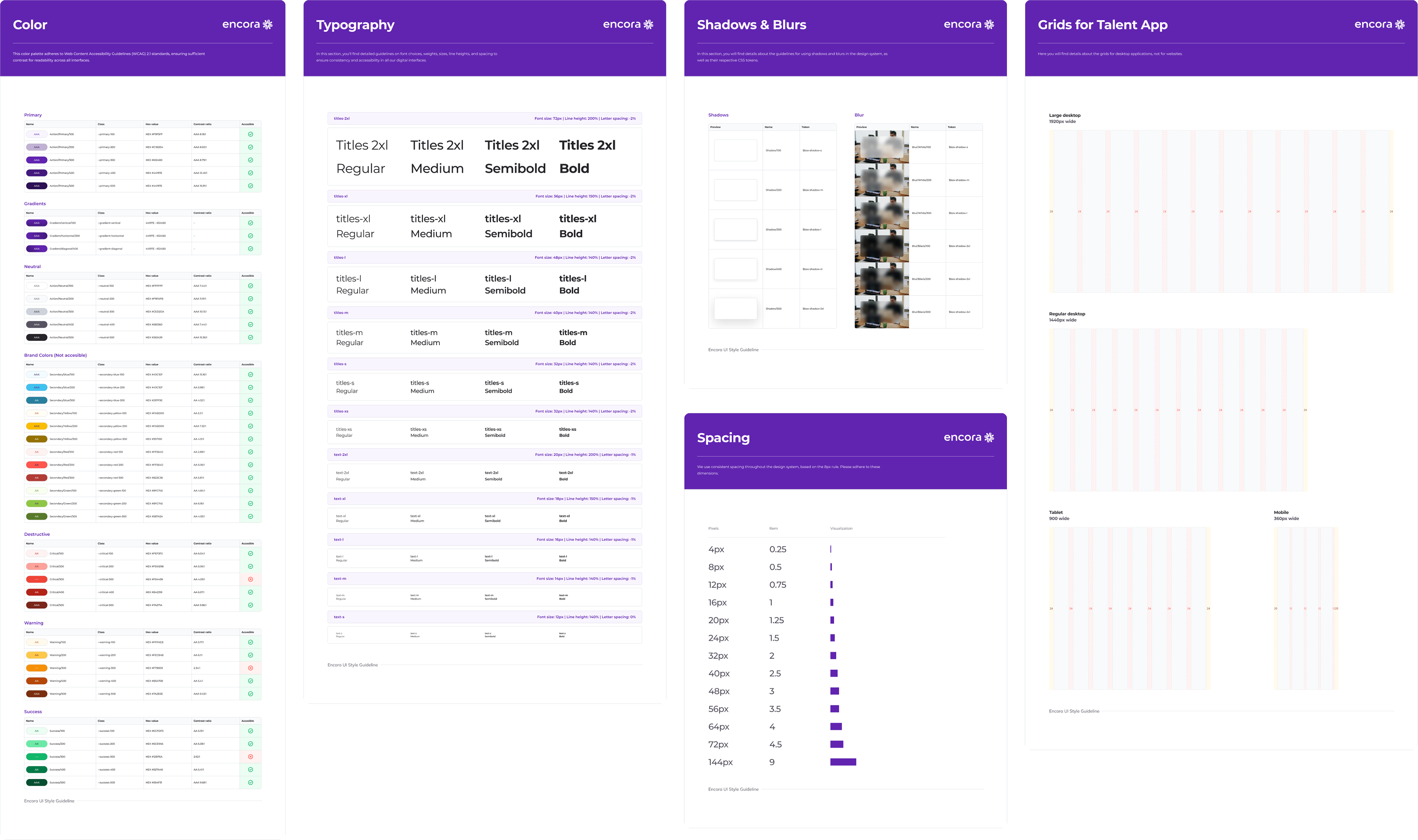
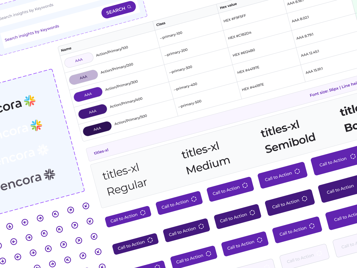
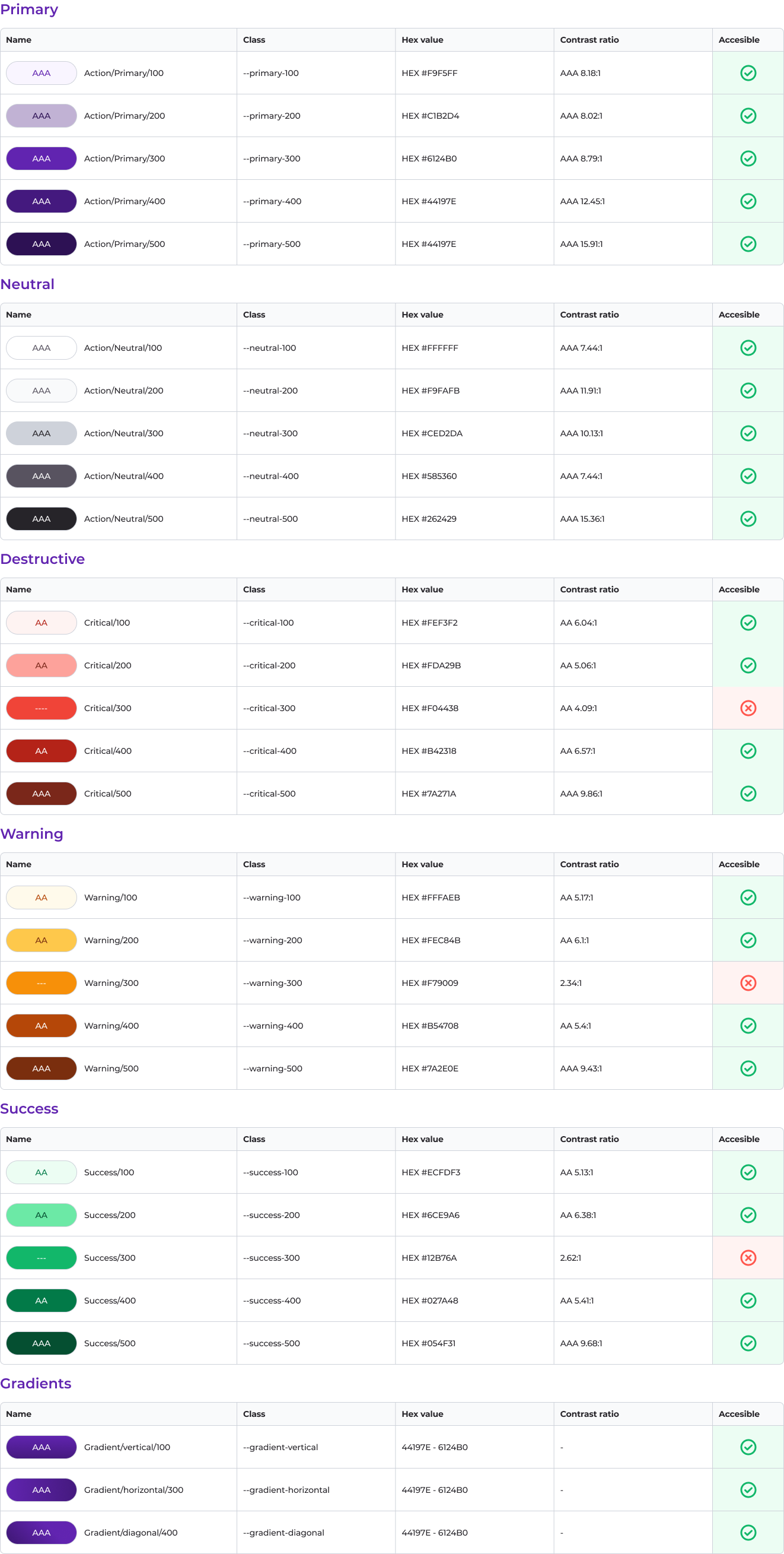
Color
All of the colors adheres to Web Content Accessibility Guidelines (WCAG) 2.1 standards, ensuring sufficient contrast for readability across all interfaces. Each color has been selected with attention to harmonization and accessibility, guaranteeing consistency and inclusivity throughout Encora Inc.'s digital experiences.
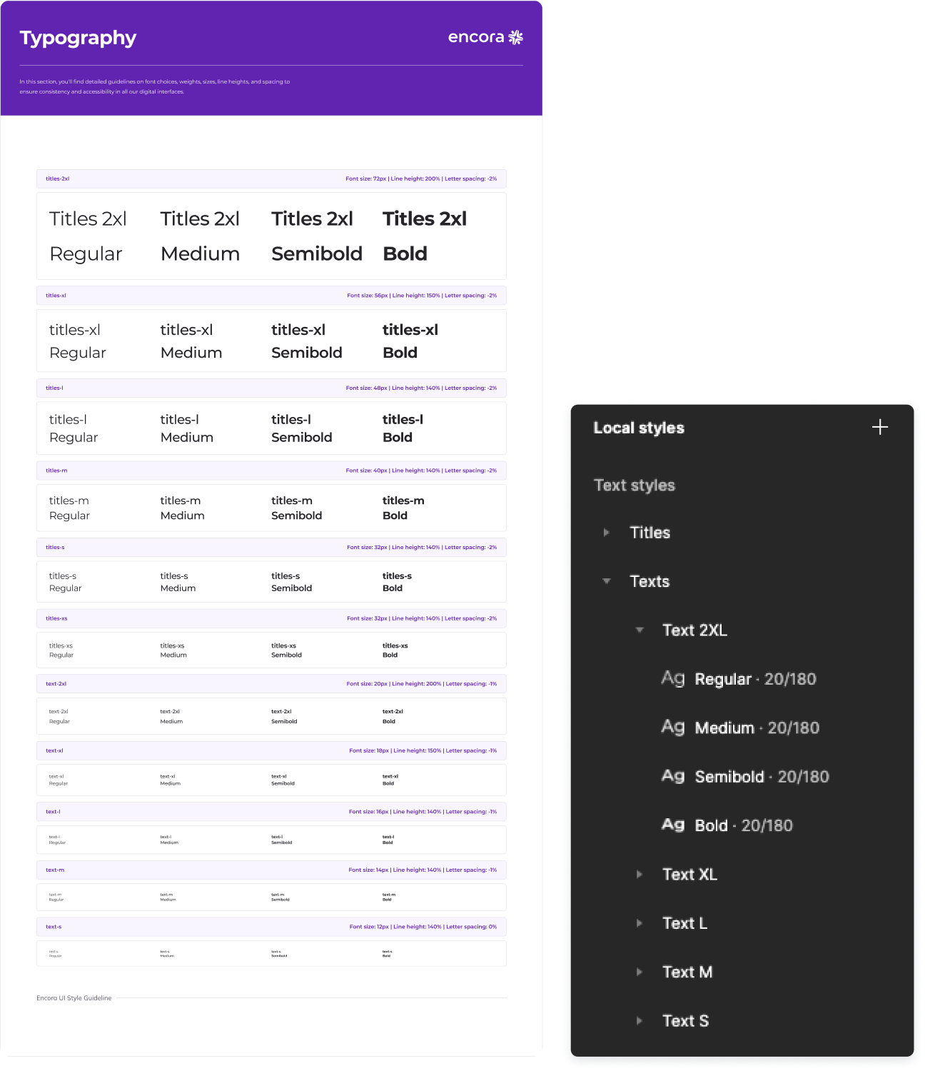
Typography
Using the brand's typography "Montserrat", we defined styles that meticulously considered letter spacing, line height, and size. The minimum font size is set at 12px, ensuring accessibility standards are met.

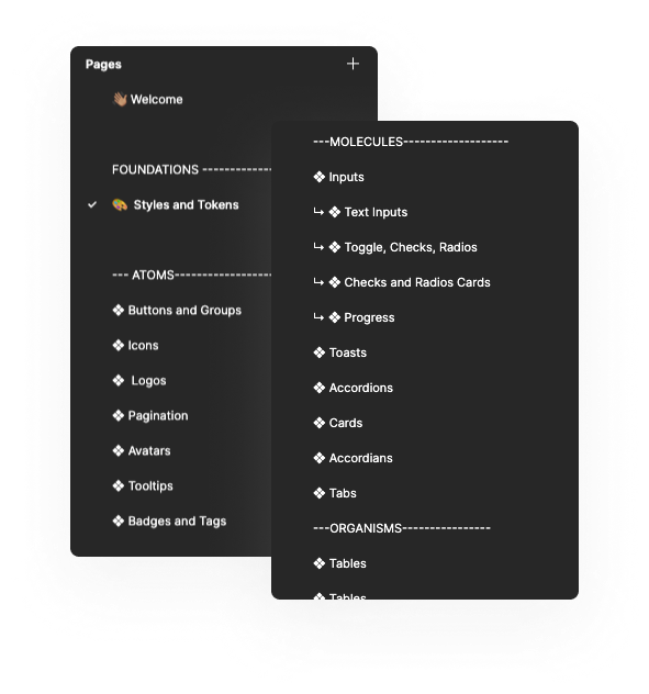
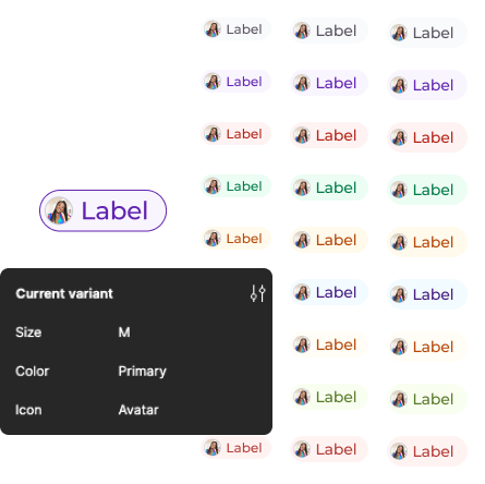
Atoms
The most basic and fundamental components of the Design System. Each atom encapsulates an individual element, such as a buttons, icons, badges, tooltips, avatars, logos, etc. These modular elements were designed with flexibility in mind, allowing for easy reuse and adaptation in various contexts and designs.
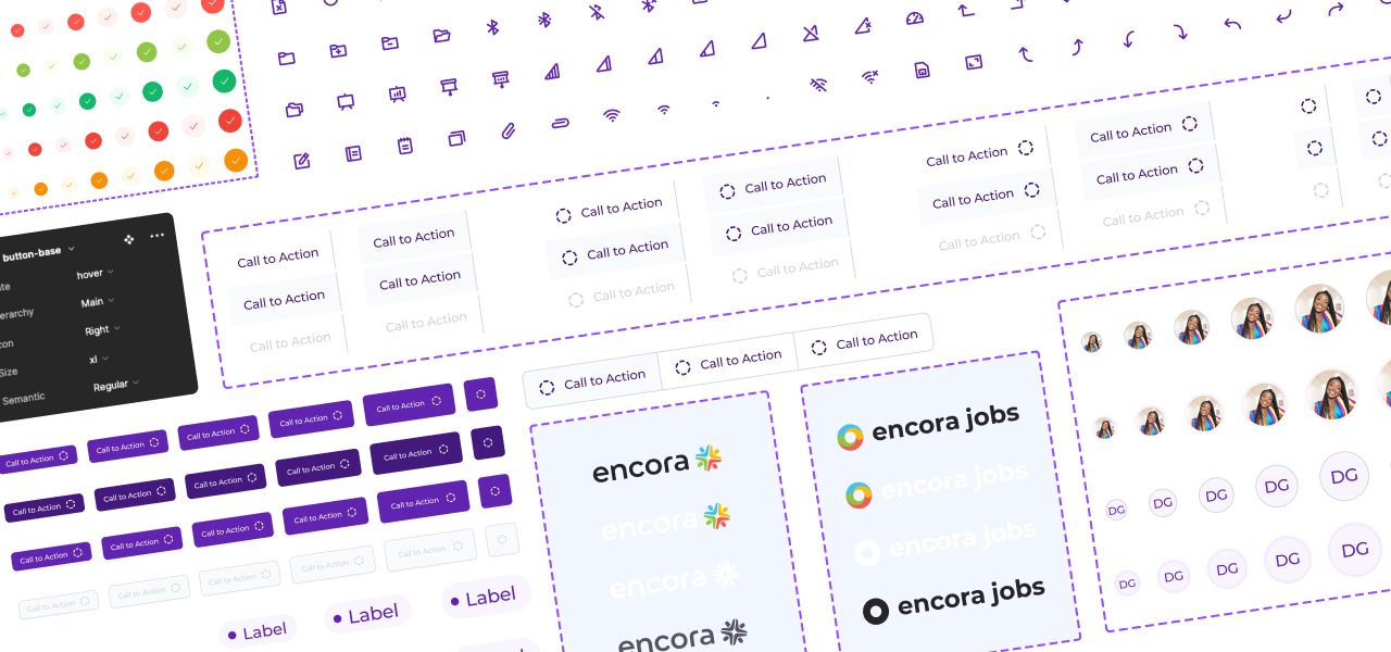
Simplifying Usage
By employing properties applied to each component, we can make every component fully customizable without the need for direct editing. Also, each variable is linked to a CSS token to streamline its implementation in development.

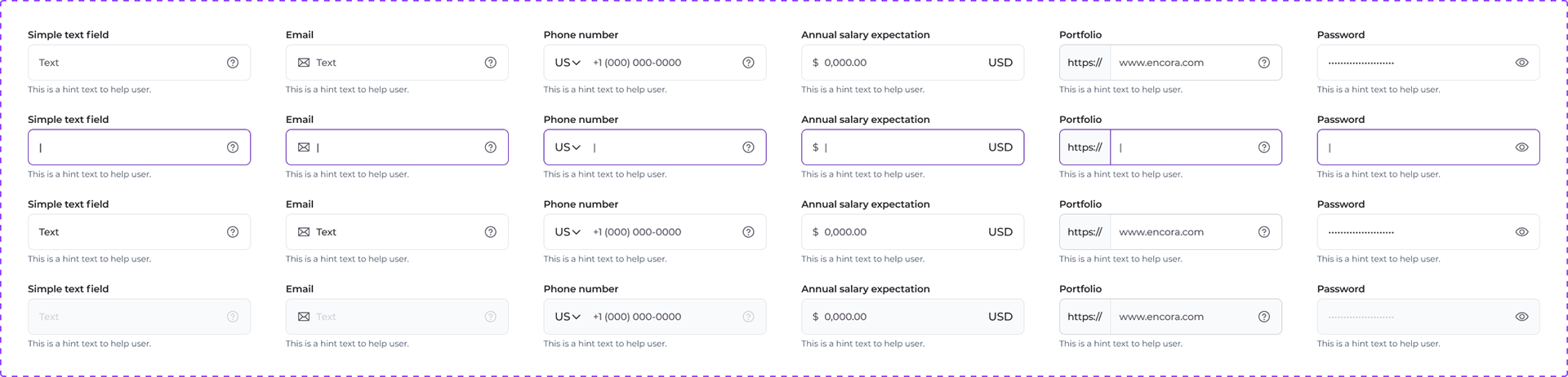
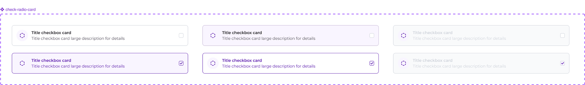
Molecules
Composed of groups of atoms bonded together to form more complex components. These components include things like form fields, navigation bars, or card elements.

Documentation
Detailed documentation for every component and section within this design system is paramount for the success and seamless implementation of this project. Each component page includes a dedicated section detailing all necessary information for its usage.
This includes:
This includes:
• A detailed explanation of typical component usage.
• Do's and Don'ts guidelines.
• Design tokens or any essential details crucial for developers.
• Photos, screenshots or examples of what the component looks like in use.
• Do's and Don'ts guidelines.
• Design tokens or any essential details crucial for developers.
• Photos, screenshots or examples of what the component looks like in use.

